Ta-da! We couldn’t be more excited to introduce you to our fresh new Swapsity logo.
On July 26th we said
goodbye to
the old logo that served us since our first launch, and
hello to a
brand new one that debuted at the Live Green Toronto Festival swap
meet.
 We
commissioned a
talented Montreal-based designer to create it and she
really poured
her heart and soul into capturing the essence of our
swapping
community in a single graphic. The new logo embodies
our friendly
and fun personality along with everything we love about
modern
barter: greenness, sharing and connecting
people.
We
commissioned a
talented Montreal-based designer to create it and she
really poured
her heart and soul into capturing the essence of our
swapping
community in a single graphic. The new logo embodies
our friendly
and fun personality along with everything we love about
modern
barter: greenness, sharing and connecting
people.
What Swapsity
means...
Want the scoop on what
Swapsity
really
means? The name itself is assembled from all the
'swaps' our
members do, combined with the suffix '-ity'. Just as
the words
amiability or frugality describe the
state of
being amiable or frugal, our name swapsity
expresses the
trait that our swappers possess. If you looked us up in
the
dictionary, you would see something like
this:
Swapsity
adjective [swɒpsɪ'ti]
Swapsity is characterized by the state or quality of
sustaining the
propensity to make smart swaps, bartering with gusto
and swapping
to the heart’s content.
Sentence
usage:
Everyone at the Swap Zone
was full of
swapsity.
Origin:
Canadian. Invented to
ignite
bartering. First known use, 2008.

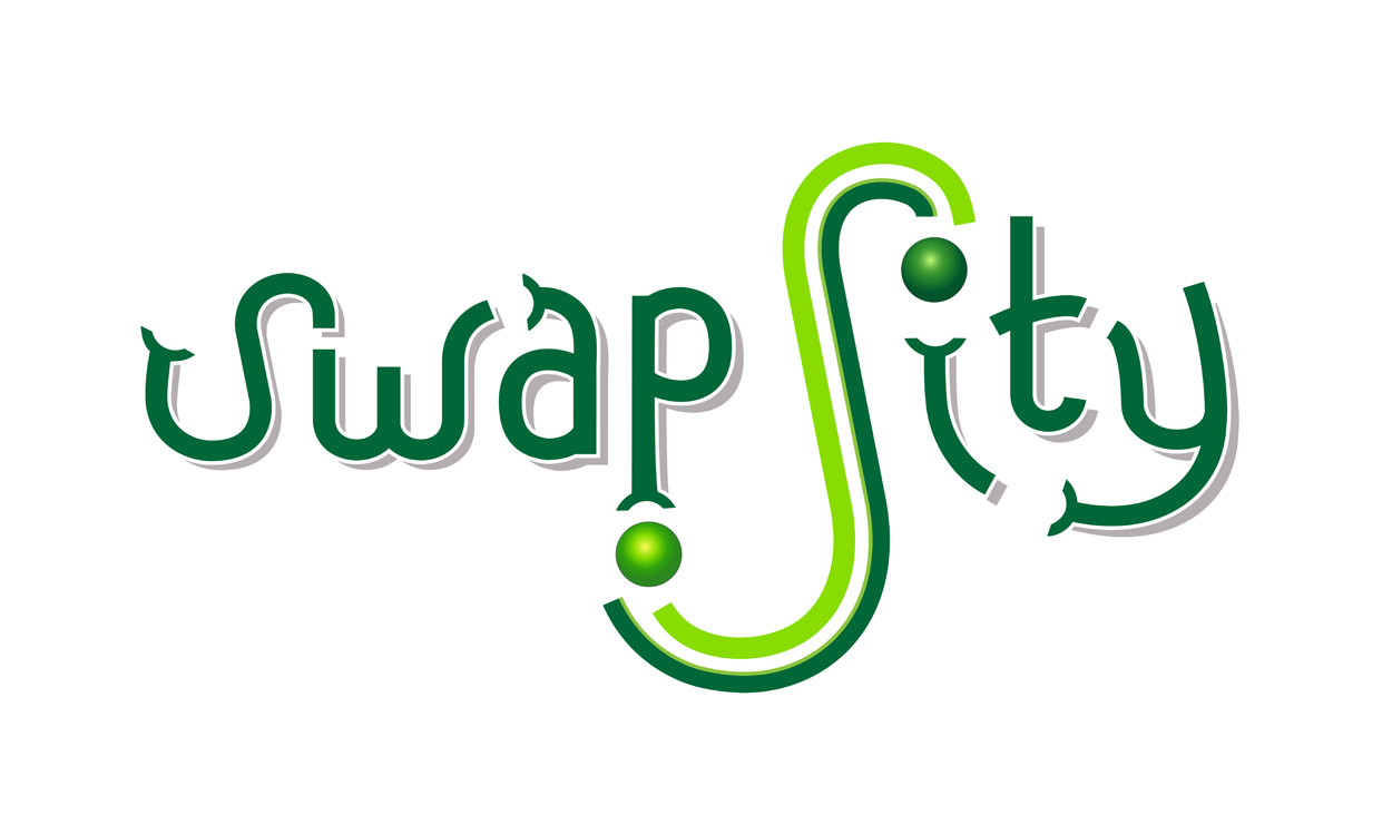
Logo
Explained...
Centrepiece:
The
centrepiece of our new logo is a big S, which
naturally
imitates the flow of the give-and-take action of
swapping. The
designer leveraged the “inherent quality of the
form of the
letter S in the logo, receiving from the
bottom left and
giving from the top right” to visually depict a
swap
transaction. The big S is also our new
icon.

Letters: The letters represent a community of swappers. The font for Swapsity was custom designed with the idea of a playful, yet contemporary, look. The letters themselves are swapping, passing things between themselves and reaching out to help one another. If you look closely you may even notice that the green letter hands resemble the arms of our mascot, Swaptopus!
.jpg)
Colours:
Colour-wise, the
light green hints at the rebirth or revival of barter
and the
reinvention of modern transactions. Dark green reminds
us that
swapping plays a role in the recycling and
redistributing items in
order to help the environment.
We dig our new logo! What
do you
think? What do you see?